Menus
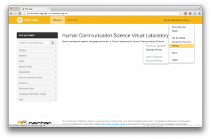
- There should be no-more than 1 main system menu, and 1 sub-menu (contained in some form of pull-out-box / quick links)
- Sub-menus should be stylized so as to differentiate them in some way from the top-level navigation, but also as being one level down in the navigation hierarchy
- The main menu should contain no more than 2 levels of sub-menus
- Submenus should first drop-down from a main menu positioned in the header, and the second level should propagate to the right of the selected sub-menu item. In the case of a left-column main menu, it should only be one level deep and propagate from left to right
- Sub-menus should propagate on click (not hover) to provide for tablet support

Quick Links
- Quick links should be to the right of the content column, but should not be combined with a left-hand column navigation system
- Quick links box should contain links such as FAQs, pertinent or frequently visited topics that are not covered by the main menu, or context relevant information
- Main menu should either be to the left of the main content column, or within the header aligned left
- Help or Support should be prominently displayed on the first page or top level menu? This menu option should then of course list all the self-help resources available

Breadcrumb Navigation
- Breadcrumb trails should provide the user a sense of hierarchy and place within a system
- Breadcrumbs should conform as closely as possible to the URL structure (or visa versa)
- Each level in the breadcrumb should be a clickable link (except the current level)
- Breadcrumbs should always appear at the top of a web page
